Disturbed
Level 9
   First ever deathmatch champ, member of BOD
Dizzy Boi
Posts: 763
|
Post by Disturbed on Apr 4, 2006 20:48:31 GMT 10
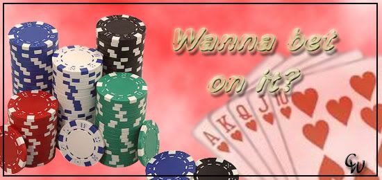
as we r yet to get a photoshop board - im posting this here. 15-20 minute job, took me ages to cut out those chips properly. I dunt liek it too much, the backgroudn is shitty - but comments please. Oh, by the way, i tried to make the text have a neon type of affect - lemme kno wat u think.  |
|
|
|
Post by Matt Hare on Apr 4, 2006 20:51:48 GMT 10
The cards are a bit fuzzy, the text seems to be the wrong colour, but other than that...I'm liking it.
The chips are cut out awesome, how do you cut stuff out? I was told to erase everything but what I wanted, but that doesn't seem right..
|
|
Disturbed
Level 9
   First ever deathmatch champ, member of BOD
Dizzy Boi
Posts: 763
|
Post by Disturbed on Apr 4, 2006 20:57:11 GMT 10
yer - cards are fuzzy as i changed their opacity (i think to 80 or 70 percent) or otherwise they were too bold (opacity makes things fade a bit). I cut it out by using the polyganol lasso tool - or sumthin to do with a magnet (risht clik on the second tool on the right i think - and it will be an option) it basically cuts out wat u put ur mouse around, but it connects (or magnitises) itself to the colours round it
|
|
|
|
Post by Joseph Malone on Apr 4, 2006 21:16:30 GMT 10
I think Chris just set the big word bar just a little bit higher....but good work on the banner, esp. the theme  |
|
Pyro
Level 7
  Living legend!
Posts: 235
|
Post by Pyro on Apr 4, 2006 23:05:34 GMT 10
Good work with the banner. I like it a lot although there is something wrong with the text. Matt you should use the polyganol lasso tool... It's the best option as the magnet won't allow you to cut it the way you want and will often connect in the wrong way!  |
|