Disturbed
Level 9
   First ever deathmatch champ, member of BOD
Dizzy Boi
Posts: 763
|
Post by Disturbed on Apr 18, 2006 11:18:38 GMT 10
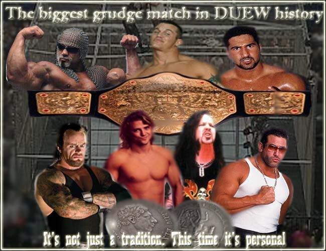
hey guys - sorry this is a little late. I must admit, it isnt my best work, but it was sorta rushed, i am real busy and just doing wat i can with the time i have. Anyway - i figure its better to have sumthing rather than nothing at all - let me know wat u think.  Good luck everyone in their matches this week by the way - lets really get sum good rp's going on! |
|
|
|
Post by Jonny Stripes on Apr 19, 2006 17:00:52 GMT 10
Its ok, Lemmys head is a bit weird at the top right hand and parts of it look far too blurry but as I said, it is ok
|
|
|
|
Post by nicho on Apr 21, 2006 14:14:23 GMT 10
yeah i think its great, ecept it dosnt have the name of the PPV on there... great work though!
|
|
|
|
Post by Julio on Apr 23, 2006 18:43:54 GMT 10
Ok, lots of people will get offended by this (including Chris). And I'm really sorry to be so harsh but...I'm not a fan of it. Sorry, but I think the cut/blending of Lemmy's head is pretty bad, and Disturbed, Lover, Nightmare and Julio could be better. Also, the background is a bit...nyehh. It looks very blurry. The title belt looks very distorted. Maybe you could of put the title belt behind the three in the match... And the coins should be blended better, they look strange. And the last stab in the heart - I don't like the text. I don't think it suits the theme one bit. You can download different fonts from heaps of places, I think one is www.acidfonts.com or something like that. Otherwise you should just google it. Sorry...I feel bad now...but I'm just giving you constructive feedback. |
|
Disturbed
Level 9
   First ever deathmatch champ, member of BOD
Dizzy Boi
Posts: 763
|
Post by Disturbed on Apr 25, 2006 15:59:24 GMT 10
Matt I'm with u - i really dont liek it. As i said, it was a very quick job, and I had a few ideas in my head (such as the coins and the cage) but it was constructed really quickly, and those ideas were sort of wasted. The reason jonny Julio and disturbed are liek they are is because i culdnt fit another 3 full size bodies into the poster. I'm not a huge fan of doing posters as I think they always look fairly crowded. The belt was a problem in it self. As you may be able to tell, to make the balt stretch further, i copied half of one side of the belt to the other side, and vise versa, so that it made it's width bigger - hence the shitty blur lines. Thankyou Matt for being honest aswell. I know I'm not great at photoshop, and I dont try to act as if i am, and this sort of constructive critisism is good for someone like me, because if beginners (such as myself) are always told they are doing everything well, then they are never going to feel the need to improve.
|
|